Brand
Everything needed to show Rdteq LLC correctly: the logo and its variants, the colours and type that carry it, and the way we write. Press and partners may use these assets to refer to RDTEQ without asking.
Download the brand kitLogo
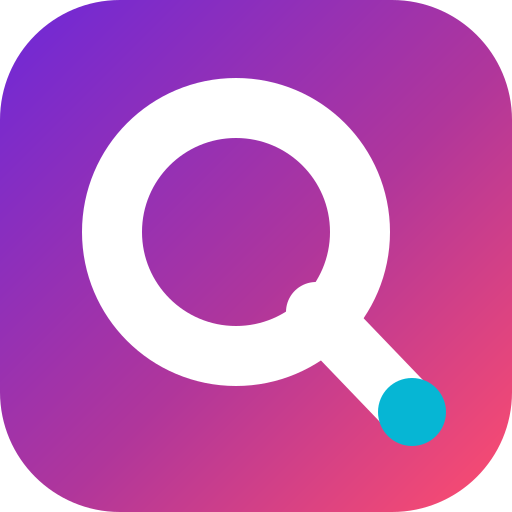
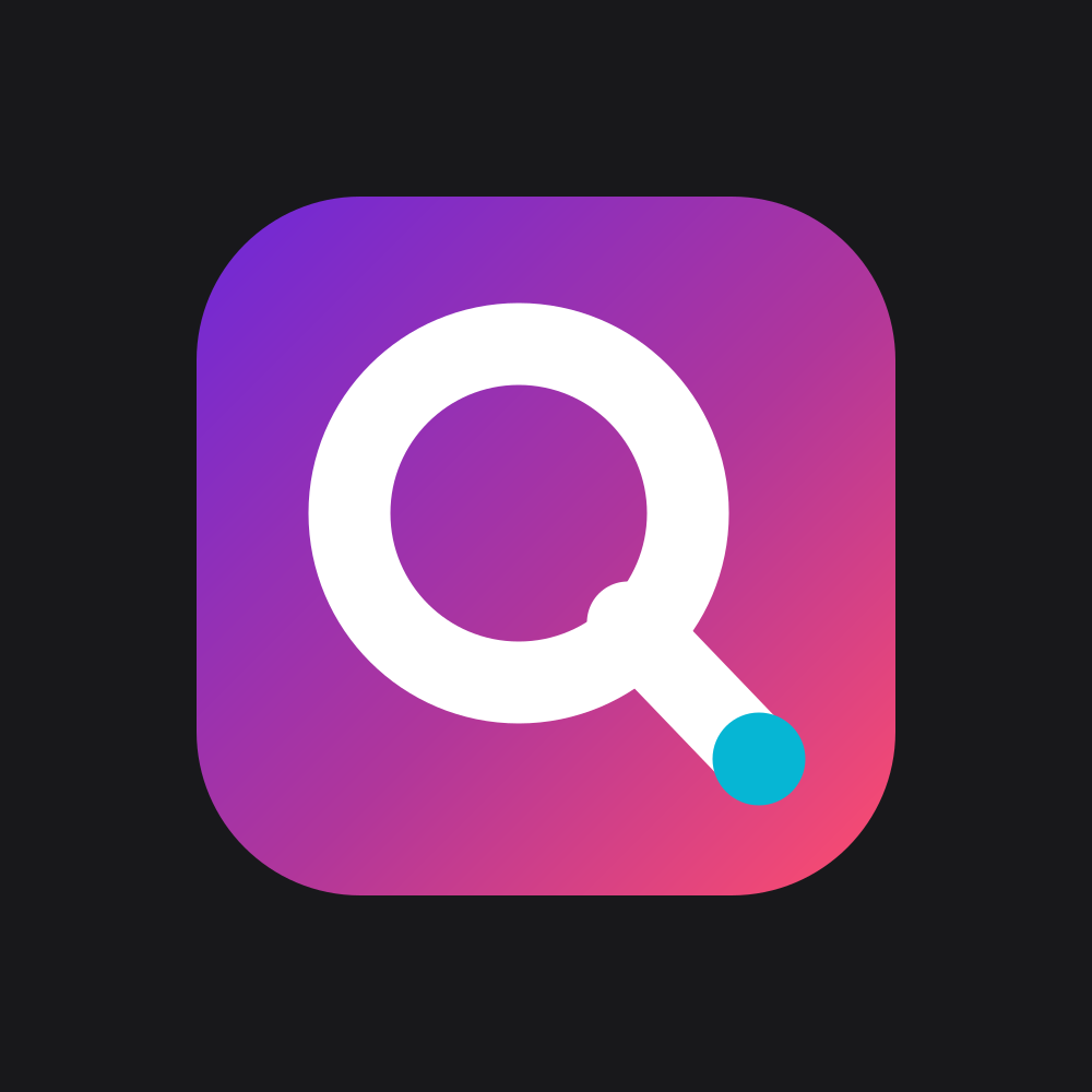
The mark is a Q drawn as a single ring with a tail, in the same monoline geometry as the wordmark. Use the lock-up unless the mark already appears elsewhere in the layout.




Mark
App icon, avatar, favicon. Never redraw or recolour the glyph.

Wordmark
Where the mark already appears nearby, or in very wide spaces.


Clear space and size
Keep free space equal to the height of the wordmark’s capital letters on every side. Do not place anything, including page edges, inside it.
- Minimum lock-up width: 96 px on screen, 22 mm in print.
- Minimum mark size: 24 px on screen, 6 mm in print.
- Corner radius of the mark is fixed. iOS applies its own mask to the app icon.
Misuse
The logo is one shape in one geometry. Every variant we allow is already in the download above.
Do not stretch
Do not recolour
Do not rotate
Do not add effects
Colour
A white ground, ink text, and one gradient that runs violet to coral. The gradient appears once per screen at most: a call to action, or the mark itself.
| Colour | Hex | Role | On white |
|---|---|---|---|
| Ink | #18181B | Text, the reversed logo field, print body copy. | 17.7:1Body text everywhere. |
| Electric violet | #6D28D9 | Primary. Links, focus rings, the first gradient stop. | 7.1:1Safe for text on white. |
| Hot coral | #FF4D6D | Accent. The closing gradient stop, never a whole surface. | 3.2:1Large text and UI only, not body copy. |
| Cyan | #06B6D4 | One detail per composition, such as the glint in the mark. | 2.2:1Decoration only. Never text on white. |
| Zinc 600 | #52525B | Secondary text on paper. | 7.2:1Safe for text on white. |
| Paper | #FFFFFF | The default ground. Dark mode swaps to #09090B. | —Never tint the page background. |
Contrast ratios are against white, measured to WCAG 2.2. Dark mode uses #09090B as the ground and lifts violet to #A78BFA so text keeps its contrast.
Typography
Two faces. Sora sets everything that carries weight, tightened so the headlines read as one shape. Inter does the reading.
Sora
Display. Weights 600, 700, 800. Tracking −0.03em on headings.
Independent software studio.
Inter
Body. Weights 400, 500, 600. Line height 1.6, measure 65–75 characters.
We build focused, privacy-respecting apps for iPhone and Mac. No ads, no tracking, no dark patterns.
Both are self-hosted at build time, so no request ever leaves the visitor’s browser for a font. In documents that cannot embed them, fall back to the system sans stack rather than substituting a lookalike.
Voice
The product promise is that we collect as little as possible. The writing has to sound like a company that means it: specific, checkable, and free of marketing noise.
Say what a thing does.
“We answer every support email within two business days”, not “world-class support”.
Name the actor.
“RDTEQ cannot read your messages”, not “messages cannot be read”.
No superlatives, no urgency.
We do not write “revolutionary”, “blazing fast”, or “act now”.
Plain words for legal facts.
The privacy policy reads like a person wrote it, because a person has to act on it.
British-neutral English, sentence case.
Headings and buttons are sentence case. Never Title Case Everywhere.
Using these assets
RDTEQ and the RDTEQ mark are trademarks of Rdteq LLC. You may use the assets on this page to refer to RDTEQ and its apps in articles, reviews, app directories and partner material, provided you do not alter them and do not imply that we endorse or sponsor you.
Do not use the mark as part of your own logo, product name, domain, or app icon. For anything not covered here, write to legal@rdteq.com.
Apple, the Apple logo, iPhone, iPad, Mac and App Store are trademarks of Apple Inc. The “Download on the App Store” badge is used under Apple’s marketing guidelines and must never be modified.
Looking for company details instead? Legal information.